VOUCHERCODES
VOUCHERCODES
VOUCHERCODES
VOUCHERCODES
VOUCHERCODES
Transforming VoucherCodes' visual language from generic stock illustrations to an image-led approach, aligning brand perception with business goals. Positioning VoucherCodes as a relatable, trusted shopping companion for its customers.
Transforming VoucherCodes' visual language from generic stock illustrations to an image-led approach, aligning brand perception with business goals. Positioning VoucherCodes as a relatable, trusted shopping companion for its customers.
Transforming VoucherCodes' visual language from generic stock illustrations to an image-led approach, aligning brand perception with business goals. Positioning VoucherCodes as a relatable, trusted shopping companion for its customers.
VoucherCodes helps people in the UK save money by finding and sharing the best discounts from thousands of retailers and restaurants. Securing exclusive deals for users across its website, app, and browser extension to make everyday spending more affordable.
-
Transforming VoucherCodes' visual language from generic stock illustrations to an image-led approach, aligning brand perception with business goals. Positioning VoucherCodes as a relatable, trusted shopping companion for its customers.
Role: Marketing & Brand Designer
Date: Apr 2025 - Present
Location: London, UK
Role: Marketing & Brand Designer
Date: 2025 - Present
Location: London, UK
Role: Marketing Designer
Date: 2025 - Present
Location: London, UK
Role: Marketing & Brand Designer
Date: 2025 - Present
Location: London, UK
-
Role: Marketing & Brand Designer
Date: 2025 - Present
Location: London, UK

Evolving VC visual language to create a more engaging, conversion-focused brand experience.
VoucherCodes had a clear ambition: to become more than a savings platform and position itself as a trusted shopping companion. Following extensive user research into our core customer personas, teams across the business came together to create a more personalised experience across the app, website, CRM and social channels.
As part of this initiative, I led the exploration and evolution of our visual language by replacing an illustration-heavy approach with product-focused
imagery, creating a visual system that felt more authentic, scalable and
Evolving VC visual language to create a more engaging, conversion-focused brand experience.
VoucherCodes had a clear ambition: to become more than a savings platform and position itself as a trusted shopping companion. Following extensive user research into our core customer personas, teams across the business came together to create a more personalised experience across the app, website, CRM and social channels.
As part of this initiative, I led the exploration and evolution of our visual language by replacing an illustration-heavy approach with product-focused imagery, creating a visual system that felt more authentic, scalable and commercially effective, while remaining unmistakably VoucherCodes.
Exploring a new visual language for engagement
Following a deep user research into our core personas last year, teams across the business collaborated to deliver a highly personalised, tailored, and relatable user experience across our channels (App, Web, Marketing Campaigns, and Social Media).
As part of this shift, I explored a new visual language that VoucherCodes customers could truly relate to and feel inspired by across our touchpoints. Moving away from a reliance on stock illustrations and introducing clear, product-focused photography ultimately drove engagement and maximized conversions to the business.
I joined VoucherCodes shortly after an agency rebrand to help evolve and elevate their brand assets, bringing more clarity, consistency, and personality. By setting up solid templates and guidelines, and shifting the focus from purely decorative to merchant-led, the result helped streamline processes and maintain VC as the UK’s most trusted code site. Here are a few of the challenges I worked through the last year, and how
I solved them:
Evolving VC visual language to create a more engaging, conversion-focused brand experience
VoucherCodes had a clear ambition: to become more than a savings platform and position itself as a trusted shopping companion. Following extensive user research into our core customer personas, teams across the business came together to create a more personalised experience across the app, website, CRM and social channels.
As part of this initiative, I led the exploration and evolution of our visual language by replacing an illustration-heavy approach with product-focused imagery, creating a visual system that felt more authentic, scalable and commercially effective, while remaining unmistakably VoucherCodes.
This change has helped customers better connect with our content while supporting stronger commercial performance.
commercially effective, while remaining unmistakably VoucherCodes.This change has helped customers better connect with our content while supporting stronger commercial performance. Impact
The new approach had a measurable impact on engagement and conversion. Compared with the previous year's illustration-led Father's Day campaign, this year's image-led campaign delivered 6× more traffic, increased CTR from 88.9% to 111.0%, drove a 5.4× increase in sign-ups, and achieved a 2.5% conversion rate.
This change has helped customers better connect with our content while supporting stronger commercial performance Impact
The new approach had a measurable impact on engagement and conversion. Compared with the previous year's illustration-led Father's Day campaign, this year's image-led campaign delivered 6× more traffic, increased CTR from 88.9% to 111.0%, drove a 5.4× increase in sign-ups, and achieved a 2.5% conversion rate.
Impact
The new approach had a measurable impact on engagement and conversion. Compared with the previous year's illustration-led Father's Day campaign, this year's image-led campaign delivered 6× more traffic, increased CTR from 88.9% to 111.0%, drove a 5.4× increase in sign-ups, and achieved a 2.5% conversion rate.
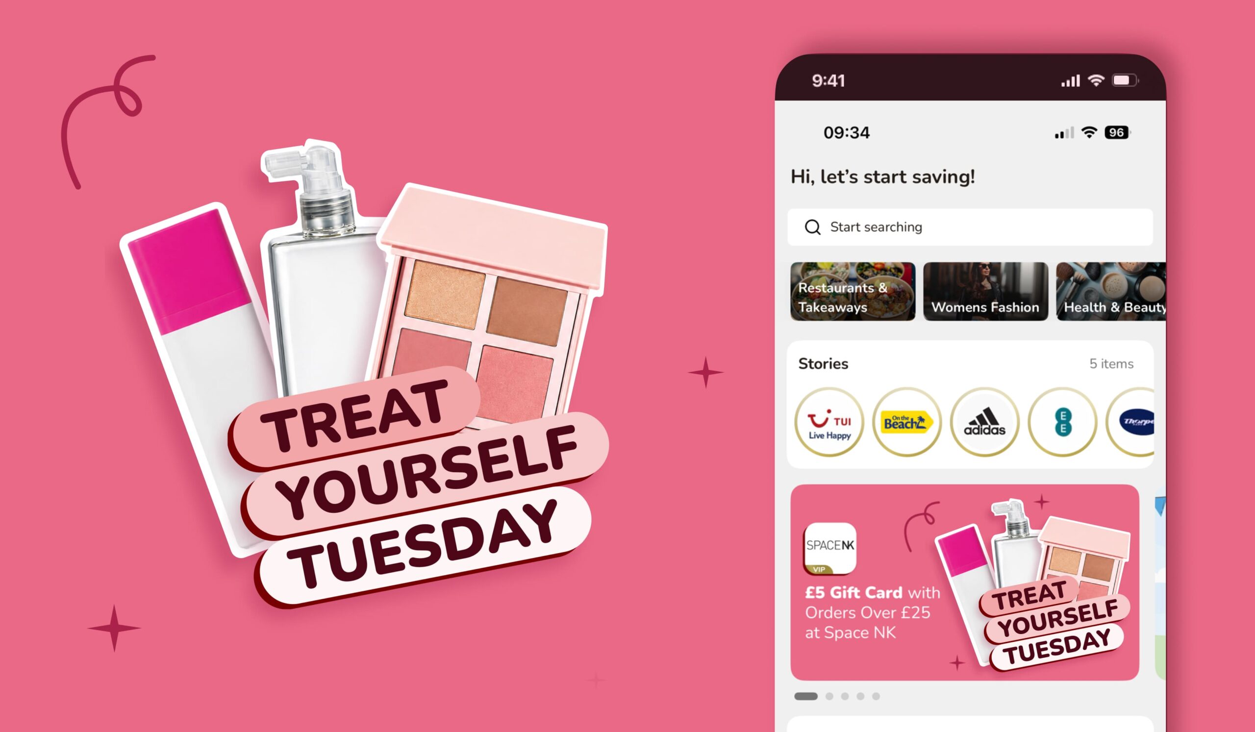
Treat Yourself Tuesday - an App exclusive weekly beauty discount campaign.
Treat Yourself Tuesday - an App exclusive weekly reward campaign by VoucherCodes
Treat Yourself Tuesday - an App exclusive weekly reward campaign by VoucherCodes
Treat Yourself Tuesday - an app-exclusive weekly beauty discount campaign.
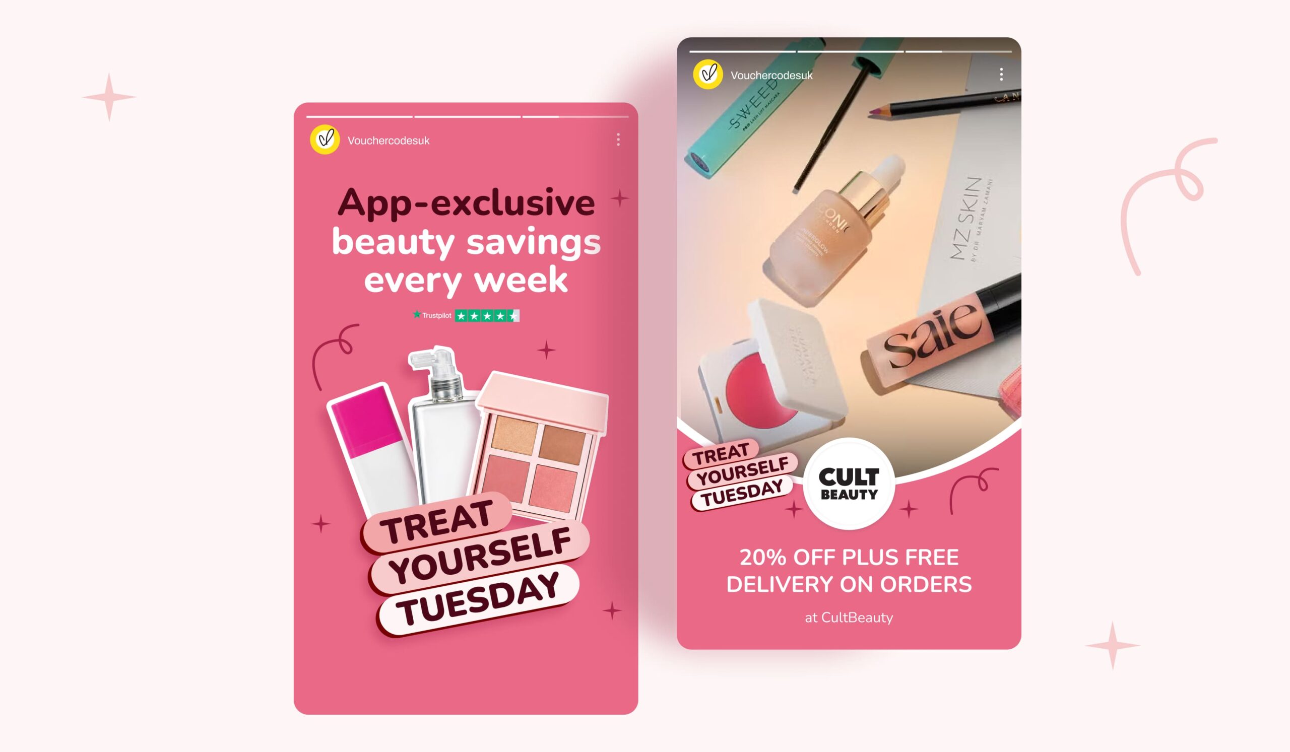
Creating a visual language customers could relate to
Our existing campaigns relied heavily on stock illustrations. While playful, they often felt generic and disconnected from the products and offers we were promoting. They also lacked the flexibility needed to support the wide variety of merchant campaigns produced across the business.
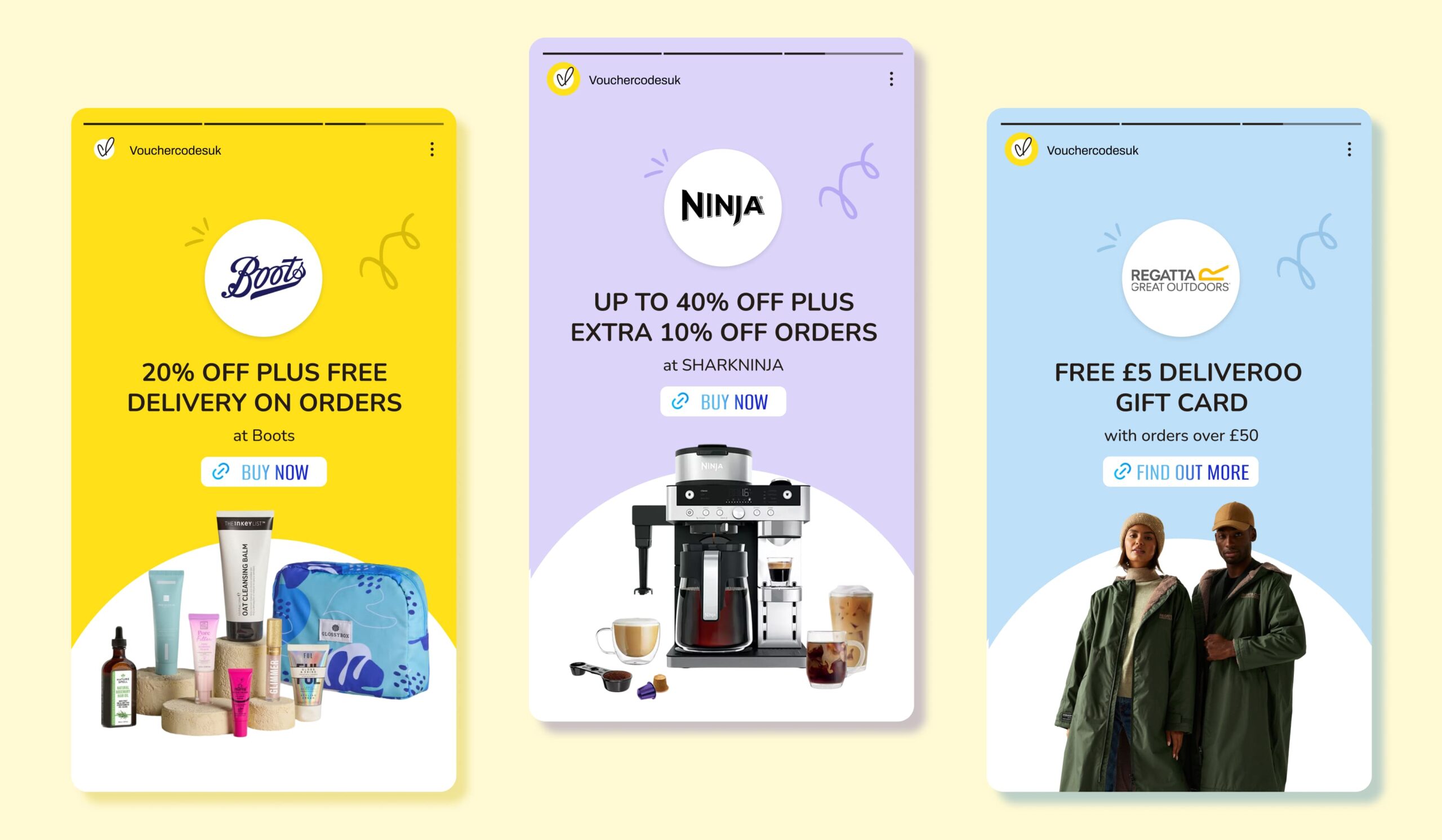
I explored a more product-focused approach, using clear non-branded photography, removing backgrounds, and introducing a subtle white outline to make products stand out across campaigns and channels.
Designing for flexibility at scale.
As the system expanded across different assets, not every image worked with the standard white outline treatment. Complex photography required a more adaptable solution without compromising consistency. Rather than forcing a single approach, I introduced a simple white backing shape for more intricate imagery.
From decorative illustrations to relatable photography
By replacing decorative illustrations with relatable photography, our campaigns feel more inspiring and product-focused. Using clean, non-branded stock photos with the background removed and a subtle white outline, combined with our expressive doodles and vibrant colour palette, created a fresh, product-focused visual style that increased engagement and contributed to higher conversion rates across our campaigns.
Rolling out campaigns consistently
A big part of my role is delivering end-to-end seasonal marketing campaigns, from concepts through to execution across the website, app, blog, social, and email. To speed things up and keep everything consistent, I refined the existing Figma templates and locked in key brand elements across assets, including CTAs, sizes, merchant logo components, and brand expressions like stars and doodles.
This streamlined the process and reduced execution time by 30%, improving both efficiency and consistency across campaigns. A good example is the Black Friday campaign (below) — VoucherCodes’ biggest of the year — which drove 345K visits, £3.69M in merchant sales, and £210K in revenue in 2025.
Creating a visual language customers could relate to
Our existing campaigns relied heavily on stock illustrations. While playful, they often felt generic and disconnected from the products and offers we were promoting. They also lacked the flexibility needed to support the wide variety of merchant campaigns produced across the business.
I explored a more product-focused approach, using clean non-branded photography, removing backgrounds, and introducing a subtle white outline to make products stand out across campaigns and channels. Combined with our expressive doodles and colour palette, this created a distinctive visual language that felt more relevant, inspiring, and consistent across every touchpoint.
The result was a flexible system that improved campaign consistency while contributing to increased engagement and higher conversion rates.
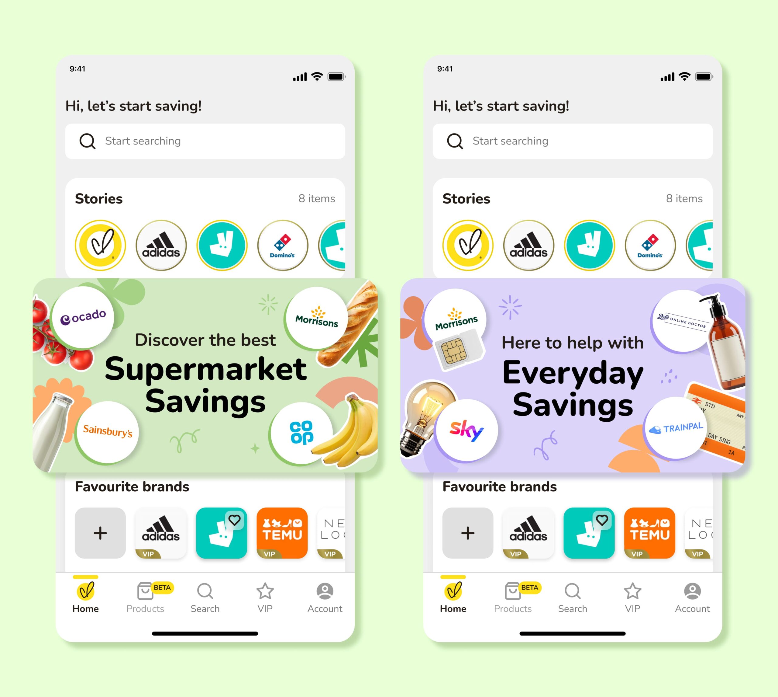
Home Page Offer Banners for App and Website
Home Page Offer Banners for App and Website
Home Page Offer Banners for App and Website
Home Page Offer Banners for App and Website
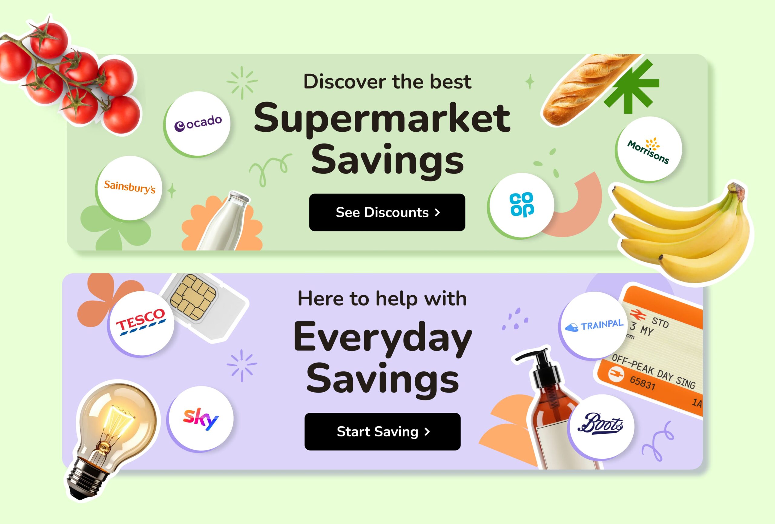
Designing for flexibility at scale
As the system expanded across different assets, not every image worked with the standard white outline treatment. Complex photography required a more adaptable solution without compromising consistency. Rather than forcing a single approach, I introduced a simple white backing shape for more intricate imagery.
Designing for flexibility at scale
As the system expanded across different assets, not every image worked with the standard white outline treatment. Complex photography required a more adaptable solution without compromising consistency.
Rather than forcing a single approach, I introduced a simple white backing shape for more intricate imagery. This maintained visual separation, preserved the recognisable
Examples of complex imagery where adding the white outline wouldn't work, I simplify it by having a white shape in the background, having a similar effect, looking on brand, and maintaining consistency.
Standardising competition templates for quick turnaround
Merchant-led competitions are a key revenue stream for the Partnerships team. By nature, these mini campaigns come in quickly and often need to be turned around in a short time. To speed things up while keeping everything consistent, I created a reusable Figma template that could be quickly duplicated for new campaigns.
Core elements stayed the same — image placement and crop, logo positioning, and copy structure — but with enough flexibility to reskin for different brands. This made the assets quicker to produce, more consistent, and easily recognisable, while still feeling fresh and engaging. Below are some examples of the most recent and popular competitions:
Designing for flexibility at scale
As the system expanded across different assets, not every image worked with the standard white outline treatment. Complex photography required a more adaptable solution without compromising consistency.
Rather than forcing a single approach, I introduced a simple white backing shape for more intricate imagery. This maintained visual separation, preserved the recognisable VoucherCodes aesthetic, and ensured the system remained flexible across a wide range of products and campaign formats.
To help the marketing and social teams work more efficiently, I translated these principles into reusable templates that could be applied consistently across ongoing merchant campaigns while reducing the need for bespoke design work.
Self-serve Merchant Offer Templates for Social Media Team
Home Page Offer Banners for App and Website
Home Page Offer Banners for App and Website
Self-serve Merchant Offer Templates for Social Media Team
Redefining the illustration style
One of the biggest challenges was the lack of a defined illustration style. Campaigns depended on sourcing stock illustrations for every brief, making the design process slow, inconsistent, and heavily reliant on trial and error. The illustrations, although expressive and playful, often made VoucherCodes feel overly childlike, reducing the sense of trust and quality
we wanted customers to associate with the brand.
Redefining the illustration style.
One of the biggest challenges was the lack of a defined illustration style. Campaigns depended on sourcing stock illustrations for every brief, making the design process slow, inconsistent, and heavily reliant on trial and error. The illustrations, although expressive and playful, often made VoucherCodes feel overly childlike, reducing the sense of trust and quality we wanted customers to associate with
the brand.
Examples of complex imagery where adding the white outline wouldn't work, I simplify it by having a white shape in the background, having a similar effect, looking on brand, and maintaining consistency.
Standardising competition templates for quick turnaround
Merchant-led competitions are a key revenue stream for the Partnerships team. By nature, these mini campaigns come in quickly and often need to be turned around in a short time. To speed things up while keeping everything consistent, I created a reusable Figma template that could be quickly duplicated for new campaigns.
Core elements stayed the same — image placement and crop, logo positioning, and copy structure — but with enough flexibility to reskin for different brands. This made the assets quicker to produce, more consistent, and easily recognisable, while still feeling fresh and engaging. Below are some examples of the most recent and popular competitions:
Redefining the illustration style.
One of the biggest challenges was the lack of a defined illustration style. Campaigns depended on sourcing stock illustrations for every brief, making the design process slow, inconsistent, and heavily reliant on trial and error. The illustrations, although expressive and playful, often made VoucherCodes feel overly childlike, reducing the sense of trust and quality
we wanted customers to associate with the brand.
The new approach established a clearer visual system that could scale across campaigns, improve consistency, and strengthen VoucherCodes' position as a trusted shopping companion.
This work laid the foundation for the next evolution of the VoucherCodes visual language, with the new image-led system now being rolled out across future campaigns and customer touchpoints.
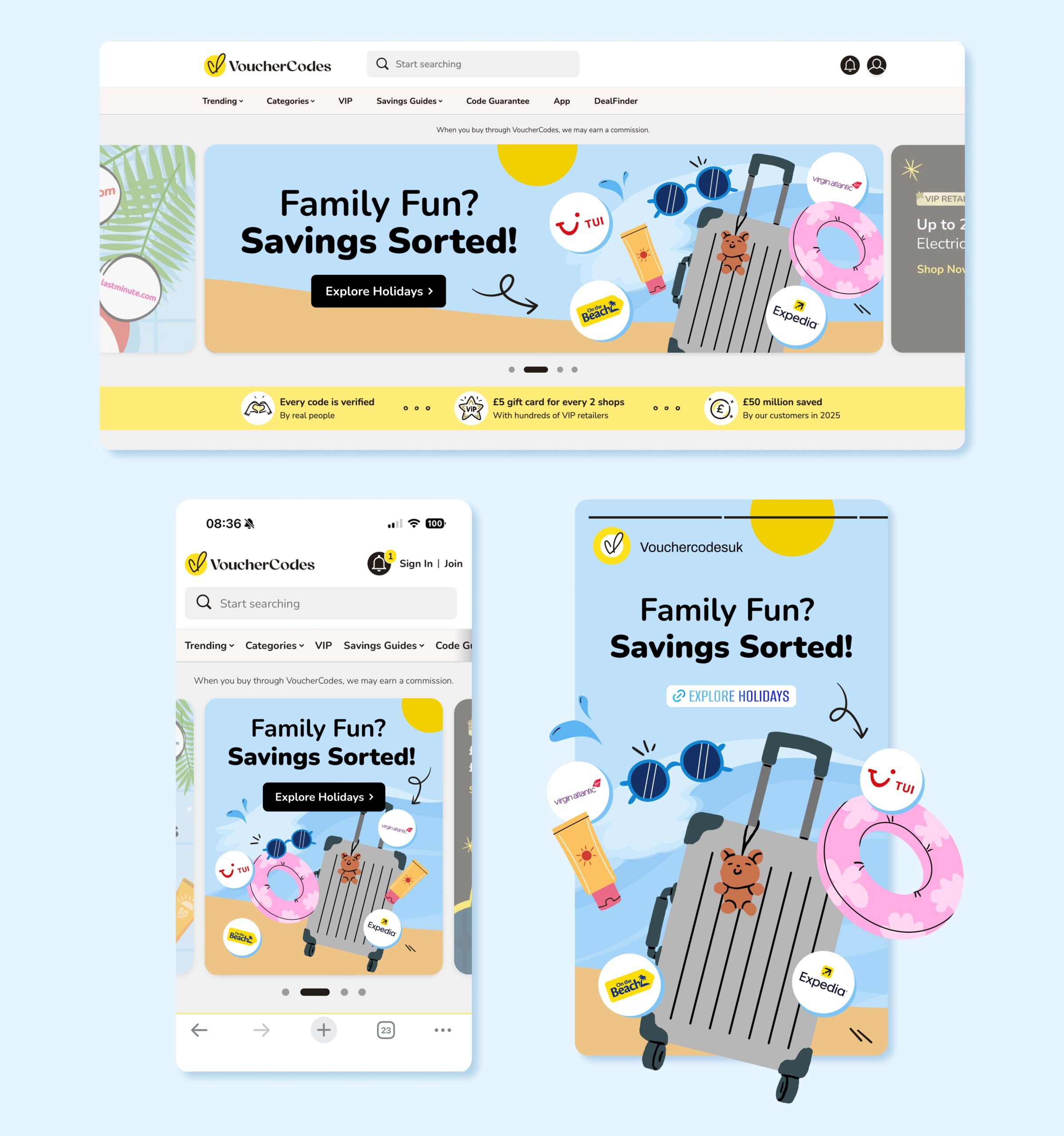
Example of previous campaign using stock Illustrations - Family Travel Campaign
Example of previous campaign using Illustrations - Family Travel Campaign
Example of previous campaign using Illustrations - Family Travel Campaign
Example of previous campaign using stock Illustrations - Family Travel Campaign
© All rights reserved. Jessica Rebelo 2026 | contact@jessicarebelo.com | LinkedIn | Instagram
© All rights reserved. Jessica Rebelo 2026 | contact@jessicarebelo.com